← Work / Hullo
Case study · Concept
Say Hullo to your pocket terminal: a native-app concept for the Vancouver–Nanaimo fast ferry.
- Concept
- Product design
- Mobile app
- Working prototype
NoteThis is spec work I made to pitch Hullo on what a native app could be. It is not affiliated with or endorsed by Hullo / Vancouver Island Ferry Company, and every number in the demo is simulated. Brand assets are used under a concept-work rationale and the app says so on every screen.
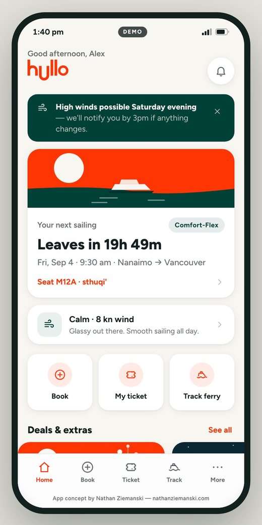
Hullo — home, ticket, track
The opportunity
Hullo runs a genuinely great service — downtown Vancouver to downtown Nanaimo in about 70 minutes — but the passenger experience lives on a website. No native notifications, no live tracking, a booking flow built for a browser, and schedules and deals that take a search to find. There was no app.
What I made
A complete, installable app concept that covers the whole journey — book, pick a seat on a real deck map, hold an offline boarding pass, track the crossing live, and share a link so your ride knows exactly when to arrive. Built as working software, not a Figma file.
Why it matters
Sharp problem framing, restraint about facts (nothing invented about Hullo), a shipped level of craft, and an AI-native workflow that got a verified, Lighthouse-98 demo live on a custom domain before lunch.
Remove the everyday friction, one pain point at a time.
Four everyday pain points shaped the concept: no native notifications, no live tracking, a booking flow that isn’t built for a thumb, and schedules and deals buried a few taps too deep. I designed the app to remove each one — then built it well enough that the first question in a meeting is “when can we have this?”
Everything here is a concept: the sailings, seats, weather and notifications are simulated, the payments never charge, and Hullo hasn’t been involved. What’s real is the design thinking, the interaction detail, and the code — it runs offline, installs to a home screen, and scored 98 / 95 / 100 on Lighthouse.
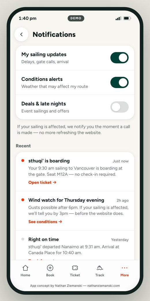
Tell me the moment something changes, before I leave the house.
The pain point
Without a native app there are no push notifications, so a delay, a gate call or a weather decision only reaches passengers who happen to be refreshing the website.
The call
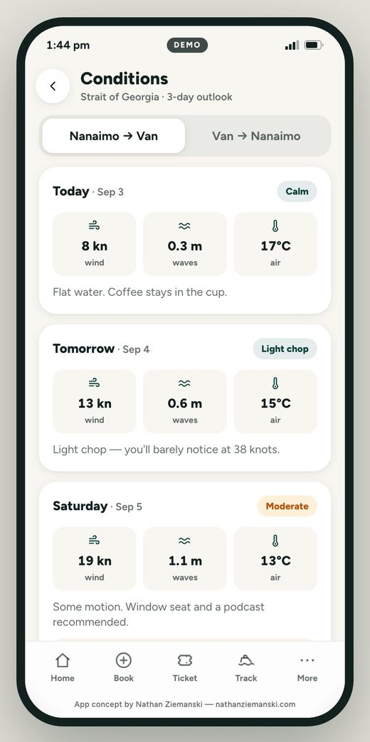
Native notifications become the spine of the app: sailing updates (delays, gate calls, arrival), conditions alerts, and deals and late-night sailings, each with its own toggle. A three-day Conditions outlook in plain language backs the alerts up, and one promise repeats on Home, Conditions and Notifications: if your sailing is affected, we notify you the moment a call is made.
The cost
It’s a service promise Hullo would have to operationalize — so the demo labels it a concept, not a policy.
“Text me when you’re close” is the most common ferry message ever sent.
The pain point
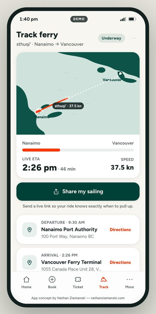
There’s no way to see where the boat actually is — not for the passenger on it, and not for the half of the people who care about a crossing and aren’t on board.
The call
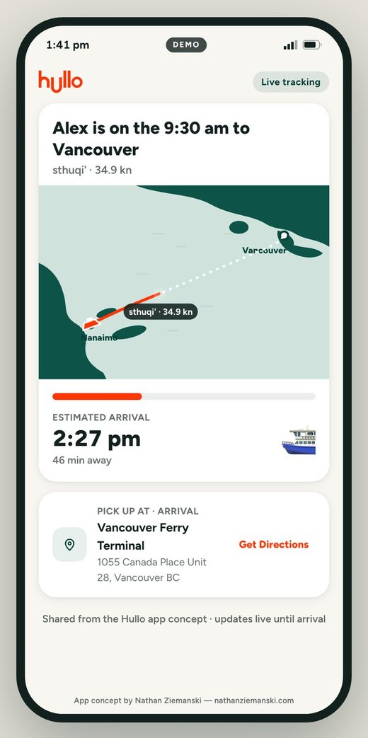
Track puts the vessel on a live map with ETA and speed, and Share my sailing generates a link to a tab-less receiver page — “Alex is on the 9:30 am to Vancouver” — with the live map, ETA, and one button: Get Directions to the terminal. It expires gracefully (“This link has sailed”).
Why it leads
I framed it as the killer feature because it’s the one that makes non-users install the app.
The killer feature is the one that makes non-users install the app.
The difference between “nice mockup” and “I could book on this.”
The pain point
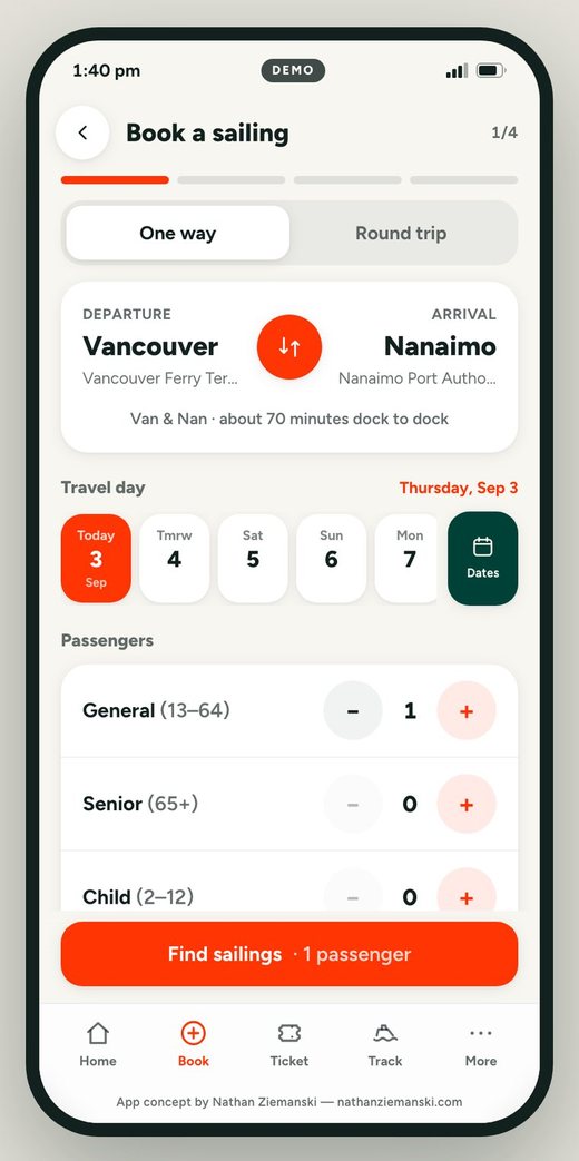
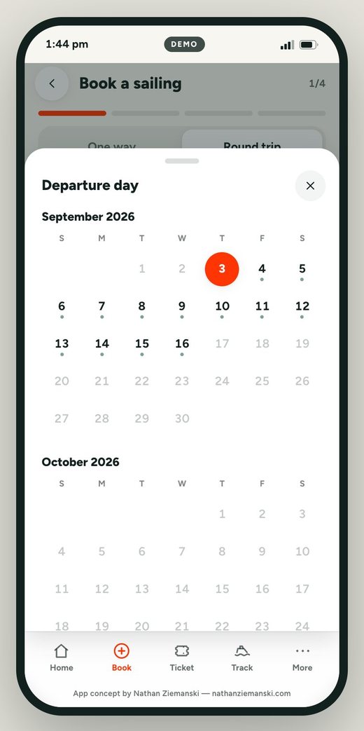
Booking on a phone through a website means small tap targets, re-entered details and a schedule you have to go looking for. My own notes after the first walkthrough pushed further: the flow needed a real date picker, and it needed a return option.
The call
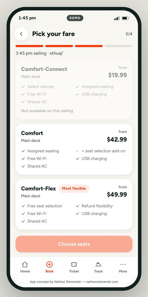
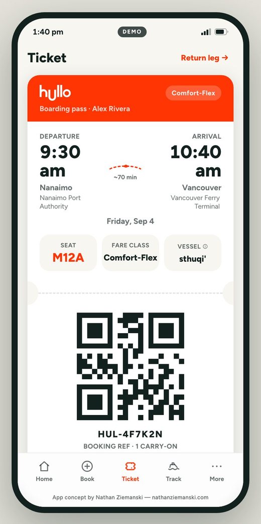
Round trip runs the whole way through — a return-day rail that can’t precede departure, one fare checked against both legs, two-leg seat selection, and a ticket that flips over to a real return boarding pass. Schedules live where you’d look for them, and the current promotions sit on the home screen and under Deals instead of behind a search.
The seat map
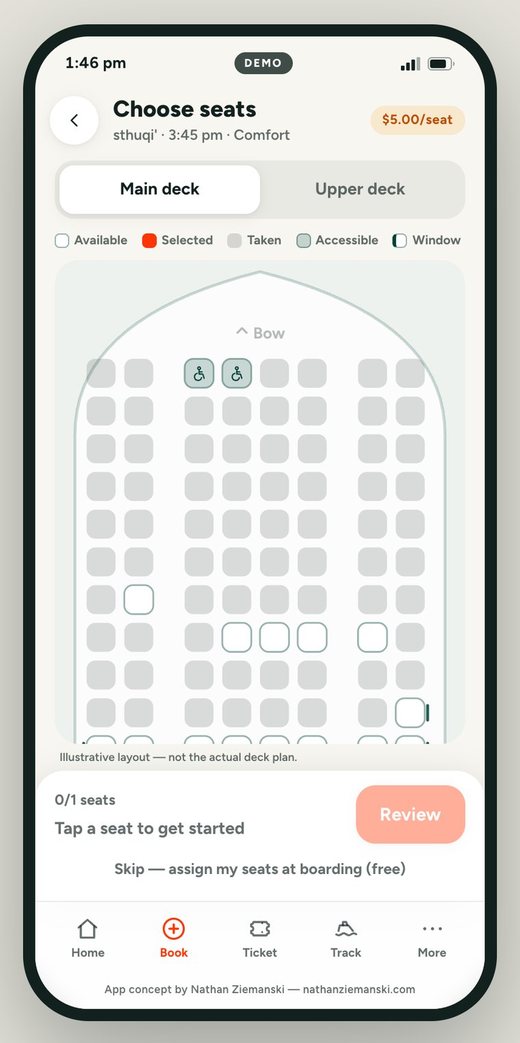
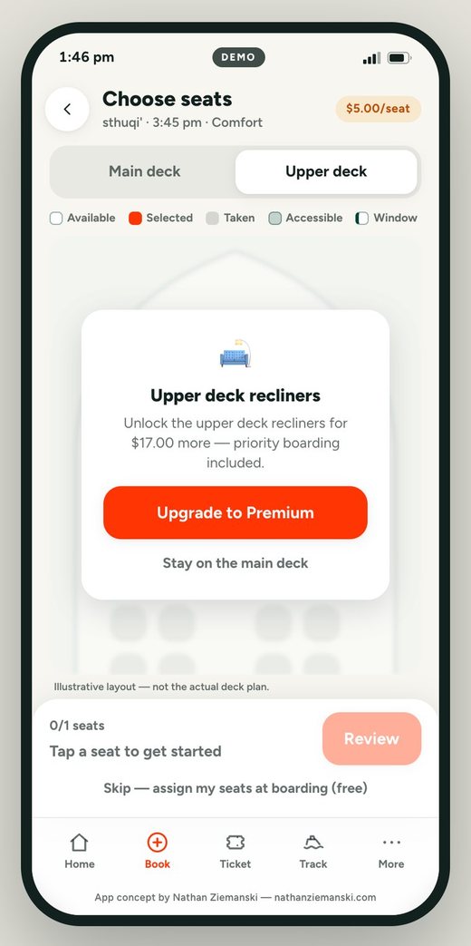
A 354-seat map generated from data, with occupancy derived from the same seats-left number the list shows. The Premium upsell is a lock, not a nag — and the screen says the layout is illustrative.
Nothing invented about the company.
Verified
Taken from Hullo, verbatim
Fare classes and prices, passenger age bands, both terminals and their addresses, the vessels and their 354-seat, two-deck spec, the current promotions, and the brand colours. Business class is deliberately left unpriced because Hullo doesn’t publish it.
Simulated
Mock, and labelled as mock
Sailings and availability, seat occupancy and the deck layout, marine conditions, notifications, the tracking feed (a crossing replayed at 8× speed), payments and wallet passes, the $5 seat add-on, the loyalty program, and the notify-by-3pm promise. No user research, no analytics, and no Hullo feedback — yet.
Ship the pitch. Don’t describe it.
A deck asks a client to imagine the product. A working demo lets them hold it — and every detail that survives their thumb is an argument you didn’t have to make.